Graphic Design
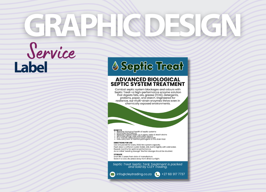
Septic Treat — Label Design
Product label design designed for Septic Treat, produced print-ready and fully aligned to the brand system.
01
The brief
A functional product competing on a crowded shelf, with mandatory safety and usage information that had to be legible at arm's length.
02
Our approach
We built a clear visual hierarchy u2014 product name, benefit, then directions and warnings u2014 with a colour block that separates the range at a glance and survives the wrap-around curve of the container.
03
The outcome
A label that meets compliance requirements and still earns a second look on the shelf.
04
What we delivered
- Label artwork
- Range colour system
- Compliance text layout
- Die-line and print-ready files
Wrap-around
Format
Included
Compliance
Colour-coded
Range
Have a similar project?
Let’s talk about your next launch.